A raft of changes: blog settings, explore and much more
New FeaturesWell, it's been a week! Well, OK, about 10 days. Productive for sure and I have no idea where to start here except to say that there's been so many changes in the past week on Scribbles it's difficult to put them here. I'll highlight a few of course and then bullet point summarise the others (maybe) — I think that would be best. In future I'll try and keep updates here within a few days, and not 10!
Scribbles is getting closer, but with that I also need to work on smaller details that I have planned and of course taking into account feedback. Talking about feedback, thank you so incredibly much to everyone that put in the time to ask for stuff and also your pain points! Really great to hear your thoughts.
New Blog Settings Screen & Goodies
Not going to lie, I've obsessed over this area for some reason and hope it meets everyone's needs. Just head on over to see all the goodies and explore — everything should be self explanatory.
With everything I am trying to also add a bit of personality throughout the UI because I think 99% of the web is boring. So hover over some of those icons and see what you think. Mash that big profile picture of your blog and be delighted — or don't be... certainly something for me then.
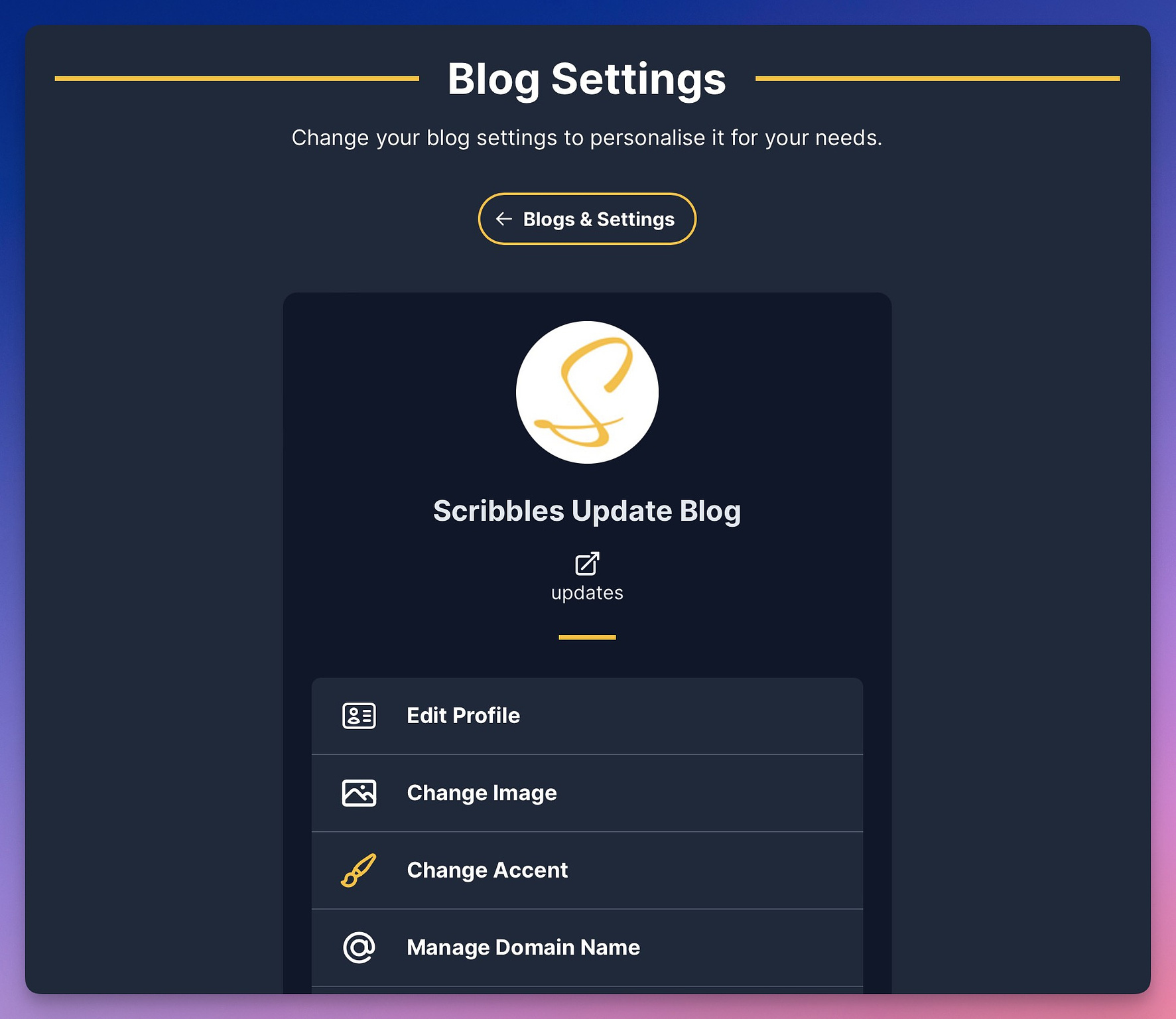
There are many things here now, so let me bullet point what we've got so far:
- Edit Profile — where you can change your blog title/name and also the introductory text.
- Change Image — change the image of your blog. Should be self explanatory 😅
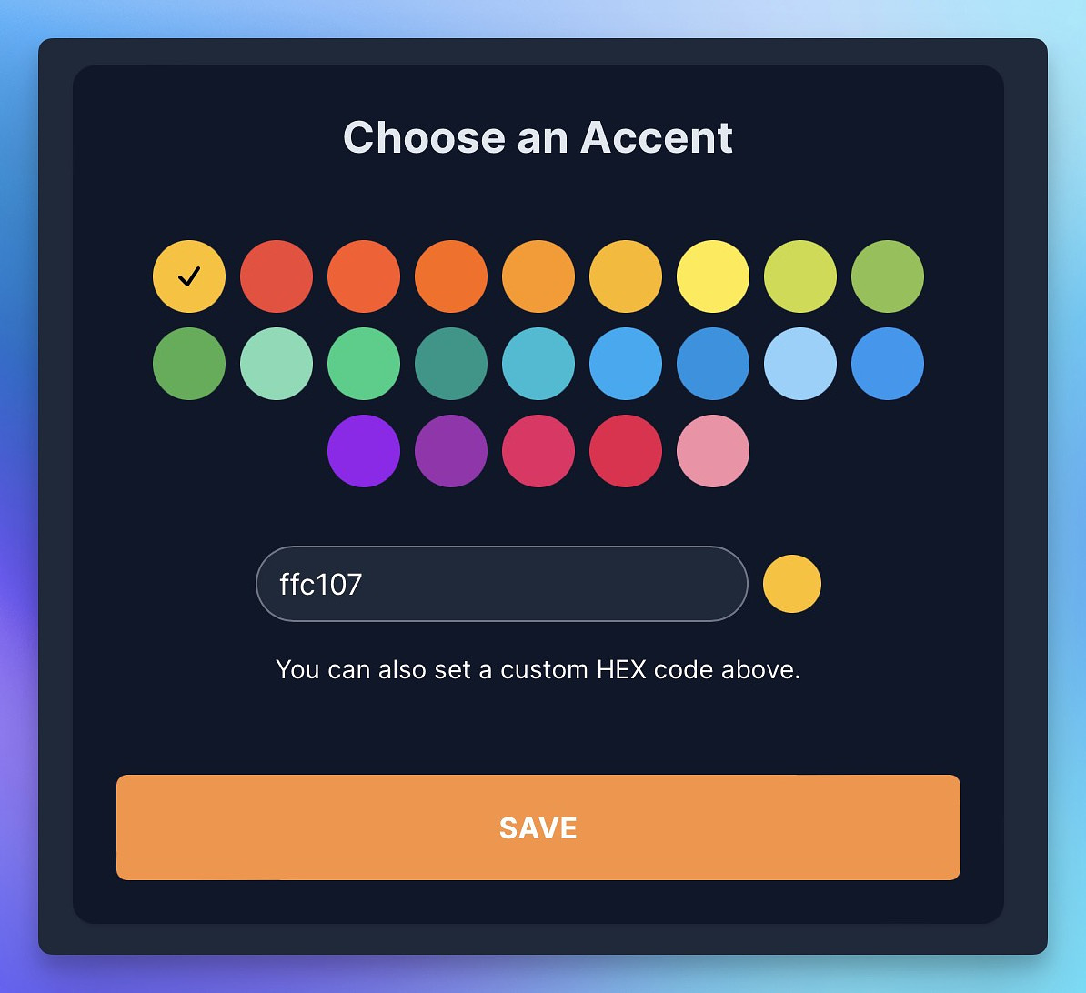
- Change Accent — Here you can change the accent of your blog, for links etc — that also allows you to set a custom accent if you really want to hone in on that colour!
- Manage Domain Name — still a work in progress!
- Discoverability — this allows your blog to show up on the explore section. More details later on in the post. This is for paid blogs only (which they all will be after some sort of trial)...
- Language — this sets the appropriate language tags, great for discoverability, of your blog. I decided to keep a short list here, so if yours is missing just let me know. Adding too many options is silly.
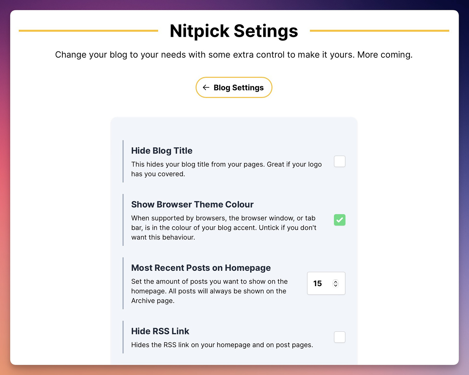
- Nitpick Settings — ah yes, my favourite area. Some extra settings that you can play with to customise your blog. More options to come!
- Analytics & Kudos — I've added Tinylytics support for tracking visitors and also show a little love... I mean kudos... on your posts.
Discoverability
This is very much a work in progress and isn't yet finished! Scribbles will have an Explore page allowing anyone to see the latest blogs on Scribbles and also the latest posts written. This is opt-in on a per blog basis and will only show your blog if you wrote your first post — oh and it'll only apply for blogs that are in good standing = paid and doesn't host anything that could cause harm to anyone — just want to keep this a friendly place.
There will be blog tiles that carry across the personality of each blog
and also each post will have details of each blog.
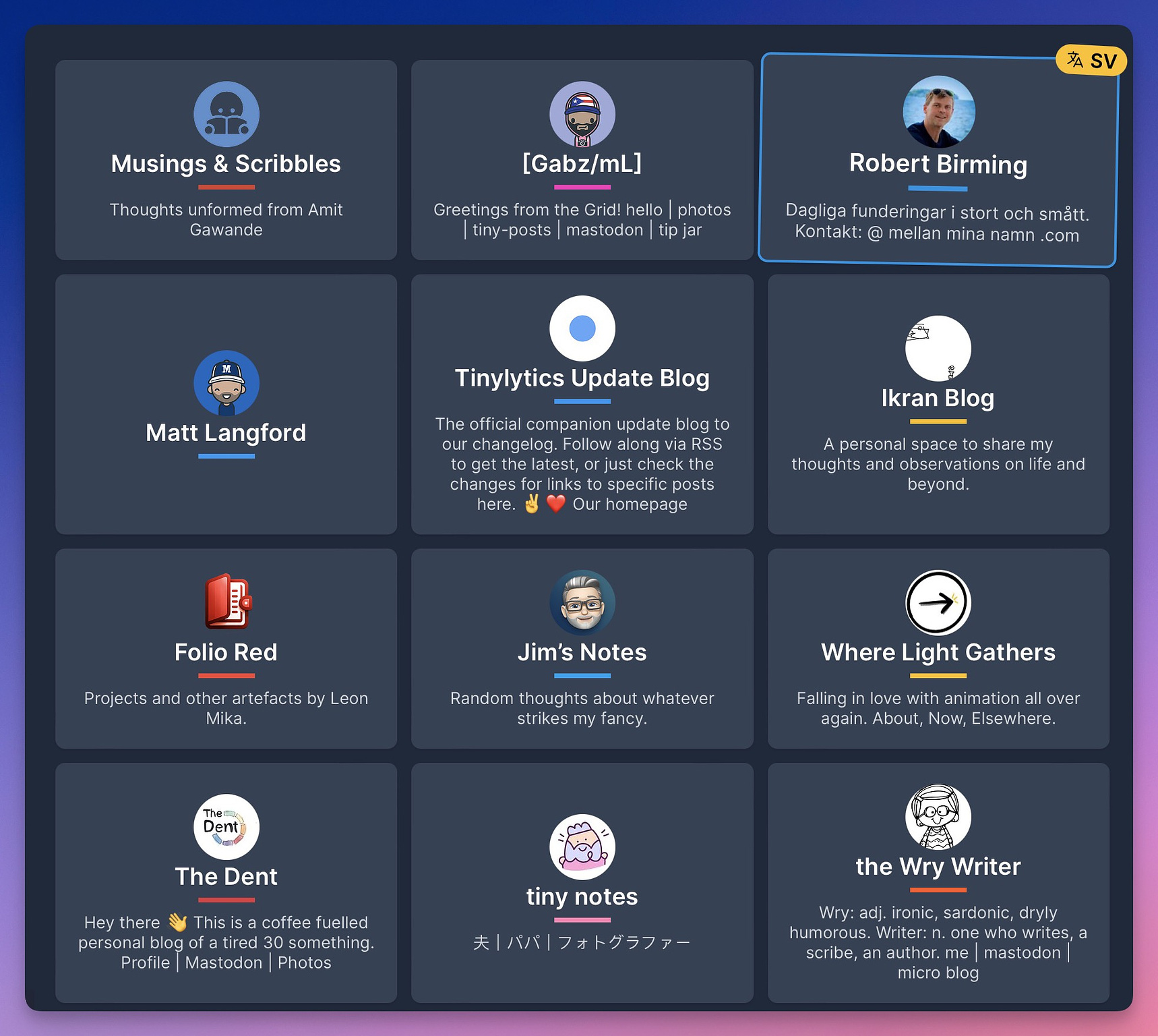
There is more work to do for me here and you can see the link to Explore under the main menu "S". It's for people with accounts for now but will be open to non users at some stage.
Watch this space!
Time zone, date picker and the editor
Ah yes, timezones... so I have to be honest — I made a mistake here. Sigh. So now the Time Zone setting on your account has been removed (for now).
Instead I have rewritten the date picker logic. It was a bit complicated to get my head around it at first so I removed the whole thing... but then I had that ah ha moment!
What happens now is that it will automatically use the time zone your computer is set at and do the appropriate thing. As easy as that and no confusion.
Which brings me to...
Date Picker Changes & Post Scheduling
You can now easily set a "Now" time and also "clear" the date with ease
— great if you've set a publish date in your draft but quickly want to
change it.

Whilst I was at it, I also added the ability to Schedule your post in the future. That means it's ready to go, but not shown until it's time. Any scheduled post is marked with a little badge of honour!

Scheduled posts will have a URL so you can check it out and see how it looks — although the editor tries to do the right thing and show it as best as it can.
Search
Yup, there is now a search page with the appropriate keyboard shortcut
to get you there. Find it in the main menu. Still a bit of a work in
progress but very functional right now. It'll surface all your posts,
draft or not.
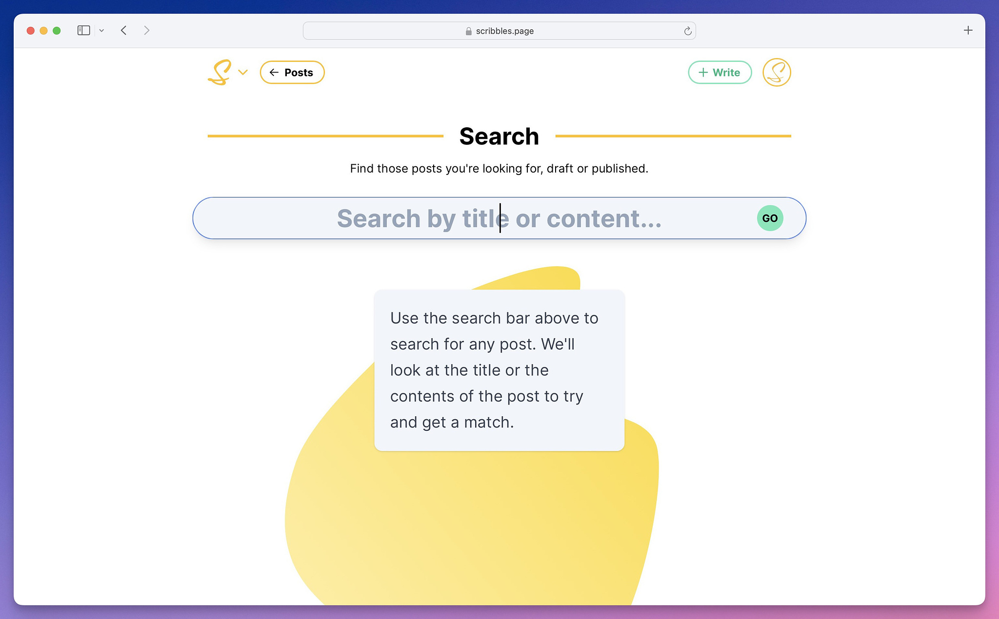
I love the way this turned out. Give it a try, and hover around.
Playfulness
I mentioned this before, but I'm playing around with the UI with little details here and there including the main blog template. As I say, the web needs a bit of whimsical fun. Please explore and see what you think... here is a quick video of one of the dropdowns (when you have multiple blogs) that shows a little bit more extra data as you go over it.
There are more little bits that I keep improving and finding. So excuse me as I scratch that itch 😁
Videos
Wait, videos? Yeah, as you see above they also work — I still need to work on making this show in the editor in any meaningful way... but they work and are delivered via CDN. Can't wait to see what you do with that. I have some ideas already.
Archive Page
Totally forgot about this one and just remembered! Blogs now have
archive pages. So if your posts exceed your 15 posts, or whatever you
have set in Nitpick, it will show an archive button. Grouped by year.
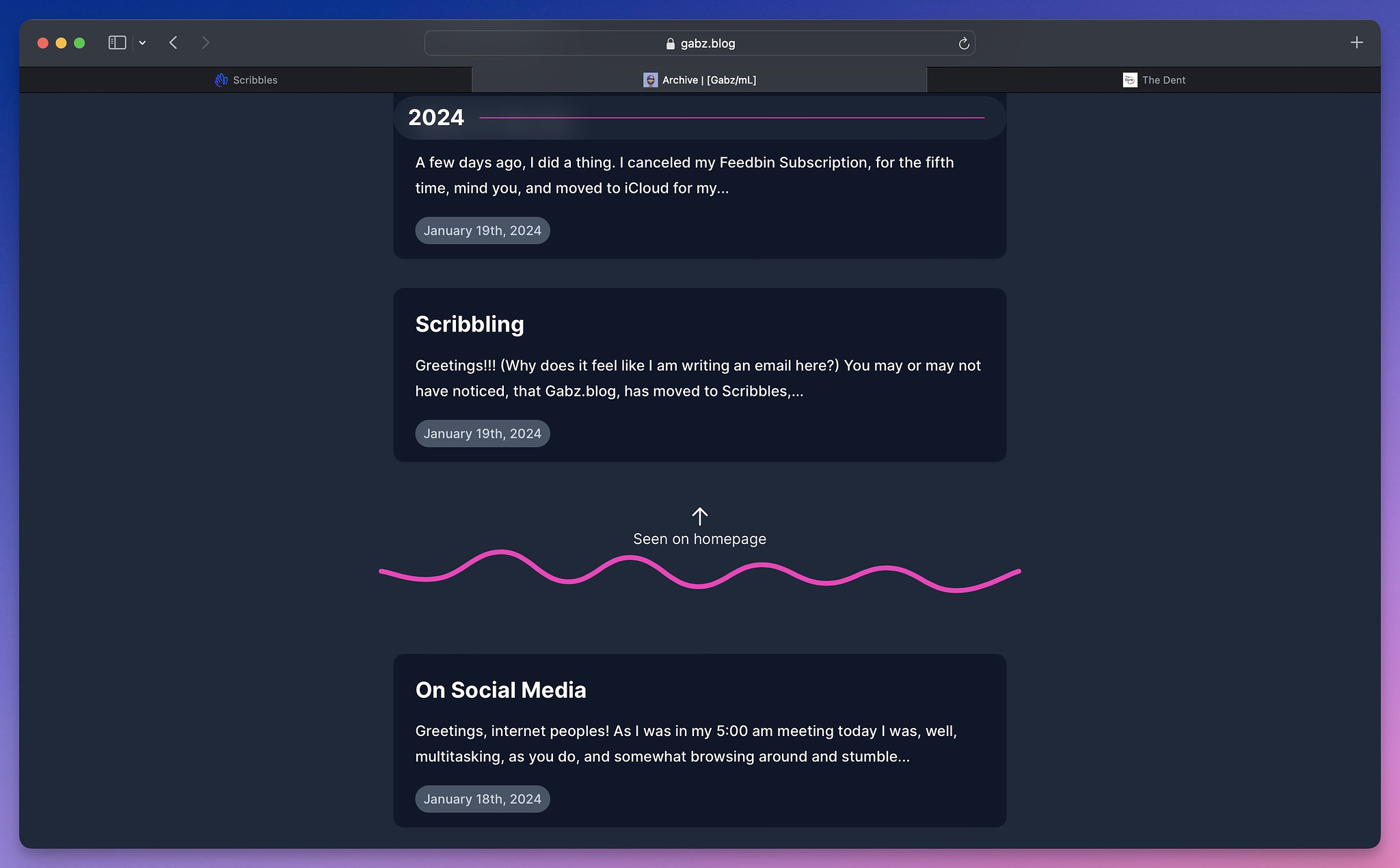
And did you notice the divider? Yeah? Well, it'll highlight the posts that appeared on the homepage of the blog.
So much more and more to come!
I probably forgot 50% of what I shipped in the past 10 days. And this post is getting long.
I've invited many more people in the past week and am replying to all emails I get as best as I can.
Thank you all so very much for the positive vibes and feedback.
Till next time.
✌️❤️