HomeScreen and Things
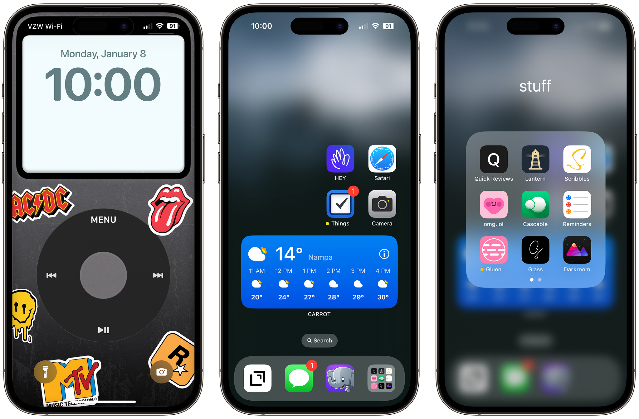
Blogit is a new year, and thus as is tradition, a new homescreen setup. However, I am sure that in the year of our lord, 2024, this homescreen setup, will definitely change many times over. And yet, here we are. The idea for this setup came from, mastodon. Many times people will share their setups and if my first thought is "Hm, that's weird" or Hm, that's interesting", I try to mimic it to understand why. Call it curiosity, I guess.
So here's my current setup.

One page and 4 of my most used apps are right in the middle right side of the screen. Hey, the only third-party email client/service that has ever stuck to me and how email should be, in my brain, that is. Safari, and Things. Things. has been a somewhat new or recent reintroduction to my workflow, more on that in a separate post I suppose. And then there's the Camera app, I have never got used to the swipe left from the home screen, in fact, I forget is a thing so I have it on my home screen. I don't like having apps on the top 2 rows these days, they tend to be a little hard to reach so the middle right is the sweet spot, actually, then the carrot weather widget at the bottom.
The Drafts app has lived in my dock since the beginning of time. I have tried to remove it in the past but it's muscle memory at this point and I don't intend to retrain my brain at this point. Quick notes and blog posts happen here. Then there's the Messages app, that's pretty self-explanatory. Ivory, my Mastodon client of choice, and then there's a "mini app drawer". Here are either bookmarks for web apps or "tools" I want to have easy access to rather than trying to remember in which category in the app drawer they might be.
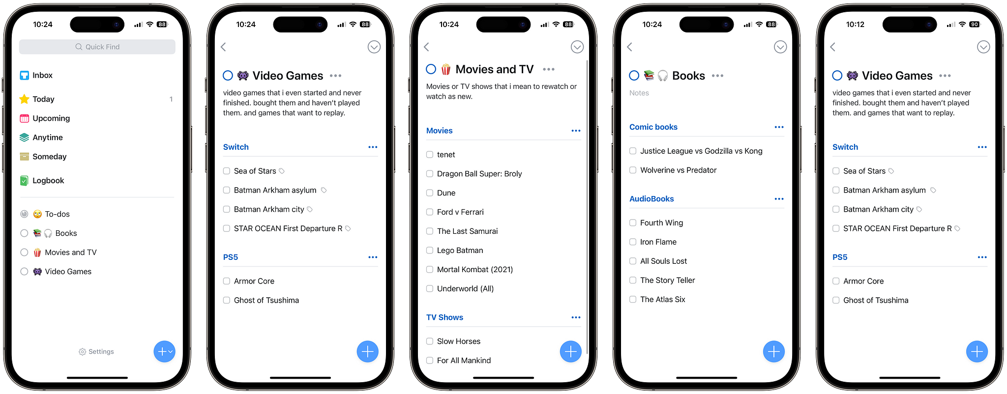
Things!

Well, I had this idea of using Things not just for tasks, which are not many, at least for personal, to track things. I know that there are many apps out there that do this exclusively, in fact, I have been using Sequel for a while but there is always a, I don't know, visual component or navigation, that makes me not use them as much or forget I have them and I don't end up tacking or checking off anything. I do like simple lists and that is what I am building with things. Simple lists that are readily available and I don't have to navigate much around the app. I have three "Projects", Video Games I want to replay or ones that I purchased and never played then or finished. TV shows or movies that I either need to get watching or have been meaning to rewatch for a while but I forget. Audiobooks that, again, I either started and never finished or that are in the queue, and comic books.
This is a new 2024 experiment let's see how it goes. The one thing about using things for this that I am not a fan of is that I don't like the progression circle, I would much rather have a number of items in the project or list, like on Todoist, for example. I bet I could use Reminders for this as well, and I have tried in the past, but Reminders is such a rarely used app, it is mostly for shared lists between my wife and me, and Things 3 is prettier.
Let us see how this goes.
Alright kids, until next time!
