
New Scribbles features
metaI'm going through a period of hyper-fixation at present, and apparently my obsession target this time is this blog. My posting rate will definitely slow down soon, and I will be happy with the many and various changes around here at some stage too.
In fact, when this current obsession wears off, you might not see me again for a month or more. In the meantime, I'm sorry to hog the new posts feed!
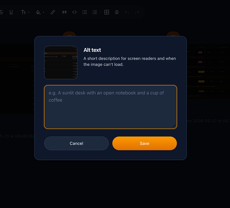
I had emailed Vincent yesterday afternoon, to ask if he could perhaps consider adding a better alt-text editor box (than the current basic one line pop-up) to his feature request pile at some stage.
An email arrived from him early that evening to say he'd implemented a new editor box for alt-text, so I could now check it out and let him know if it was as expected.
It was. It makes things a whole lot clearer when I'm trying to make images a whole lot clearer for those who can't see them easily. I'm ADHD, so a lot of the time I had forgotten how my descriptions started by the time it had scrolled off the end when using the previous single line one.
The only thing I didn't expect was how fast it was done!
On top of that, in my first post yesterday, (https://scribbles.page/blogbear/posts/first-past-the-post) I moaned slightly about the complication of the new custom theme facility being a bit heavy for me, especially as I was only interested in messing about with the fonts the standard theme used.
Vincent read my post later on in the day and messaged me again (I am NOT going to say 'reached out') around 8pm, about what fonts I would ideally like to use.
I said I was using a serif font, Libre Caslon from Bunny.net, elsewhere on another blog, but if he could offer a standard sans-serif, a serif, and a monospace choice – without non-computer people having to delve into the new customiser – I would guess that would be enough for a lot of users.
At 8.49pm, I got an email from him.
... you can (now) see font options in the "Appearance" section under your blog settings.
I've got a few for you plus the ones you've mentioned. You could also use your own bunny or google fonts.
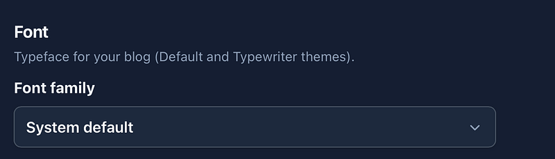
For the record, I've plumped for IBM Plex Sans for now. I like to have a sans-serif font where a capital I can be easily distinguished from a small l.
I and l
I had also said about the post's title size being a bit big for my taste, especially as I was using the smaller text function. The balance between them looked visually odd to me.

Blimey. Also added. 'Post title size' on the Nitpick options. Small, Medium, Default and Large.
All three new things are there to be used by you all now on the Default theme.
I asked Vincent if I could mention them in a post, or should I wait for him to announce them on an update, but he was happy for me to blog about them.
This is brilliant service, and I must say makes me feel slightly guilty for having moved away from Scribbles backalong, when I got frustrated about not being able to change as much as you can now.
All I actually had to do was ask questions, make suggestions, and stick with it while Vincent did the rest.
I'm looking forward to seeing how other users decide to make their blogs look now!
