There's a homescreen for that
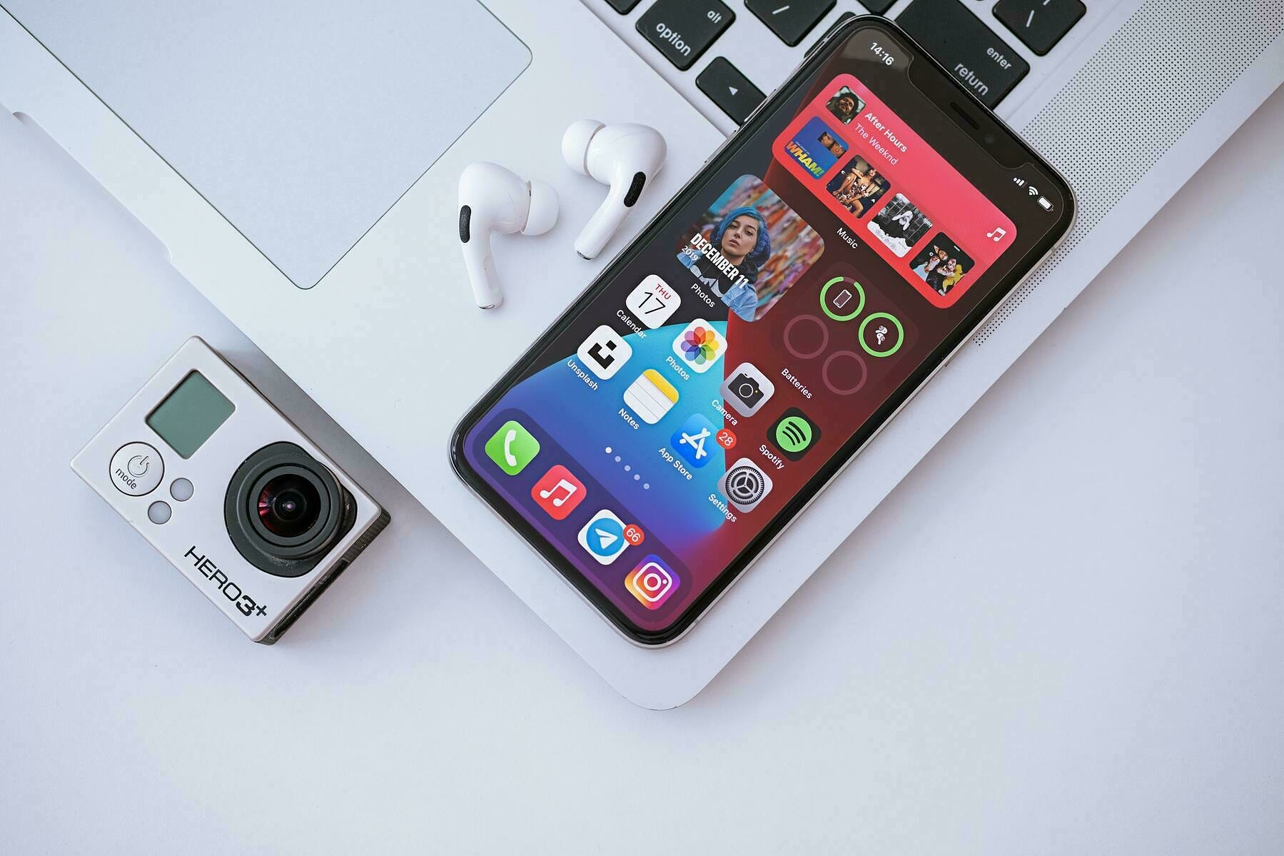
Ever since we were first introduced to iOS 14 back in June, I was excited about the prospect of Widgets in iOS. Since even the early days of the beta I’ve been struggling to get a setup I like with them, however, and that was before so many excellent third party widgets were released.
My main issue hasn’t been that I don’t like the widgets, or that there aren’t enough of them, it’s simply an issue of trying to include too much at once. I’ve disliked the iOS homescreen for some years now, so I’ve embraced the new flexibility this affords, but perhaps to a fault. Much as I tend to do with the Apple Watch, I’ve tried to populate my homescreen with widgets (or Complications with regards to the Watch) that cover every situation.
With the Apple Watch, I now have the ability to create some Shortcuts which can automatically switch my face, and in turn the connected Complications at different times of the day. This has lead to a Bed / nighttime face, a Work face, and an Evening & Weekend face.
As my widget situation quickly spiralled out of control, I thought about
trying to apply the same logic to return my iPhone homescreen to
something a little more organised, and in turn, more useful. I then
remembered the oft-forgotten function of iOS 14, namely the ability to hide homescreens. To activate this functionality, you simply
enter Wiggle Mode and then
tap the little dots at the bottom of your screen that denote the various
homescreens you have active. You will then see a scene much like the
image below, which allows you to show/hide whichever homescreens you
wish.
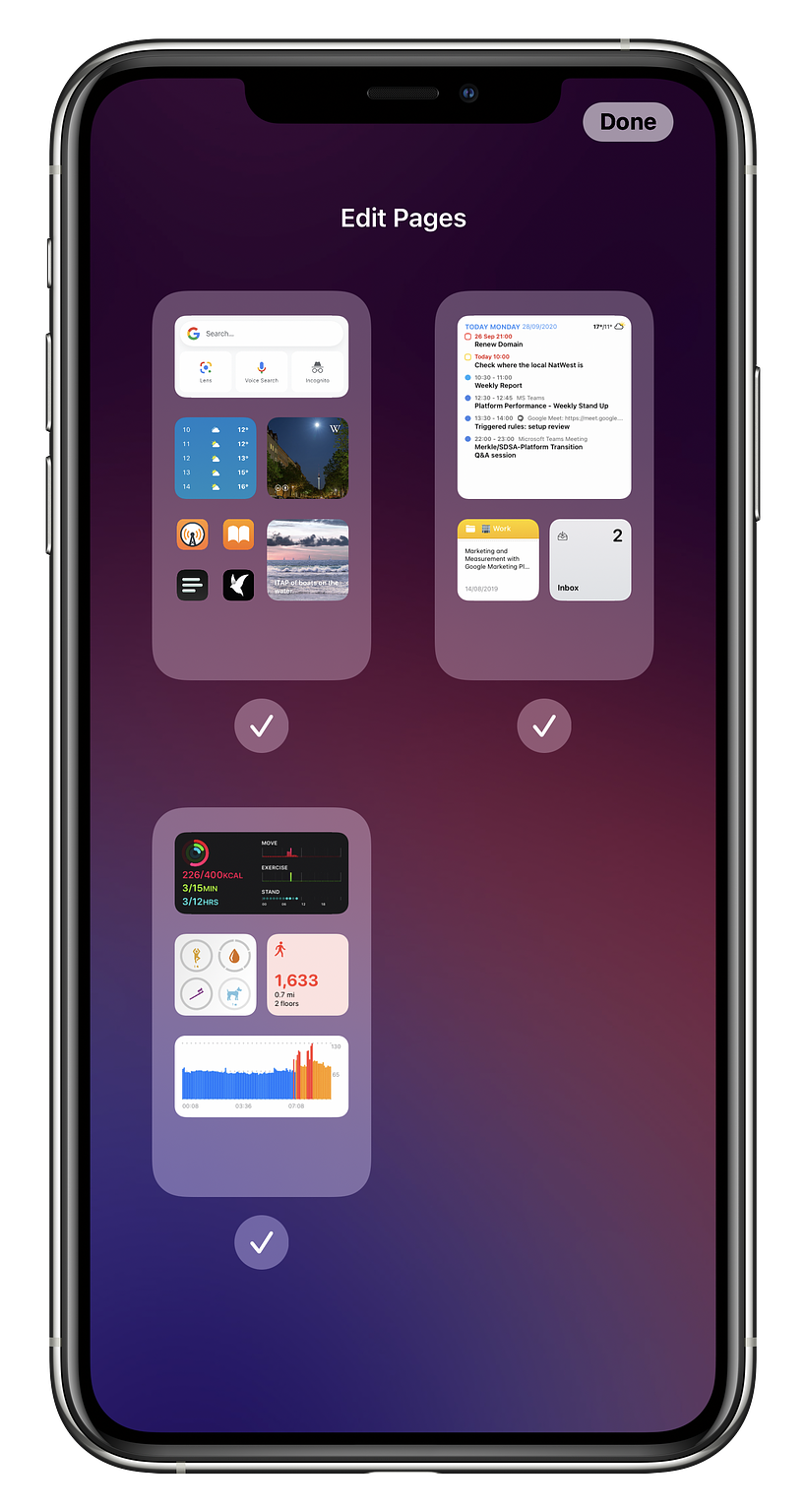
With this, whilst not, unfortunately, automated my Apple Watch setup can translate quite well into a usable iPhone setup.
The Work Phone
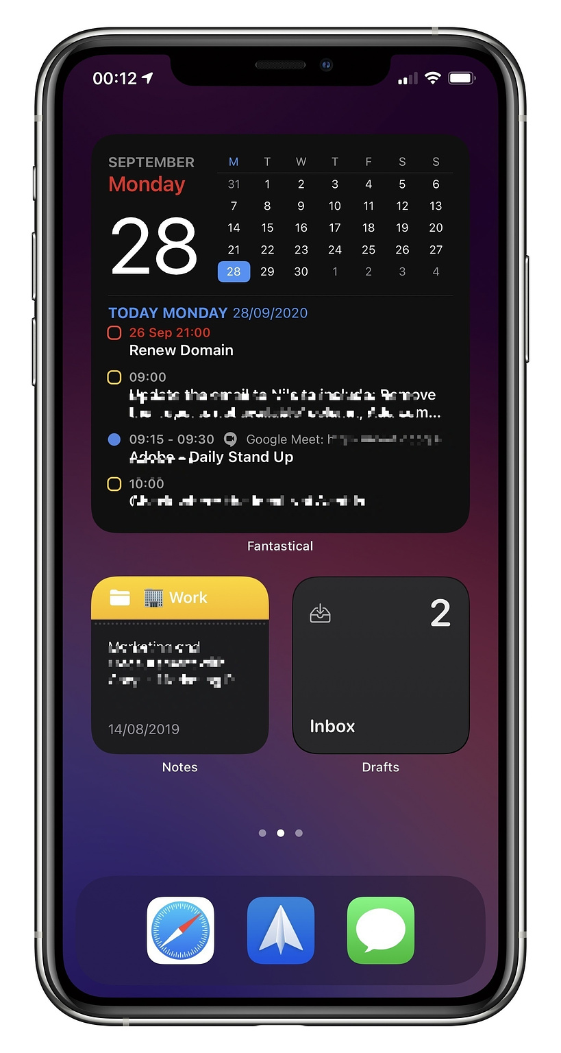
Apologies, I’ve had to obfuscate much of this screenshot, for obvious reasons, but hopefully you still get the just. This setup takes advantage of the excellent Fantastical widget to display the date, my Reminders and upcoming meetings. I have some smaller widgets at the bottom to round this off. One that shows my Work folder in Apple Notes, which is really helpful to not only jump into Notes when needed, but also to show me a snippet of my most recent Work based note. The final widget is actually a stack that cycles through my Drafts inbox, Spark Mail’s ‘New Mail’ widget and finally another Spark widget that displays the time my next meeting.
This views simple, but it brings key information I need / want at a glance during work hours, without allowing myself a quick tap into Twitter or Reddit and the like.
The Health Phone
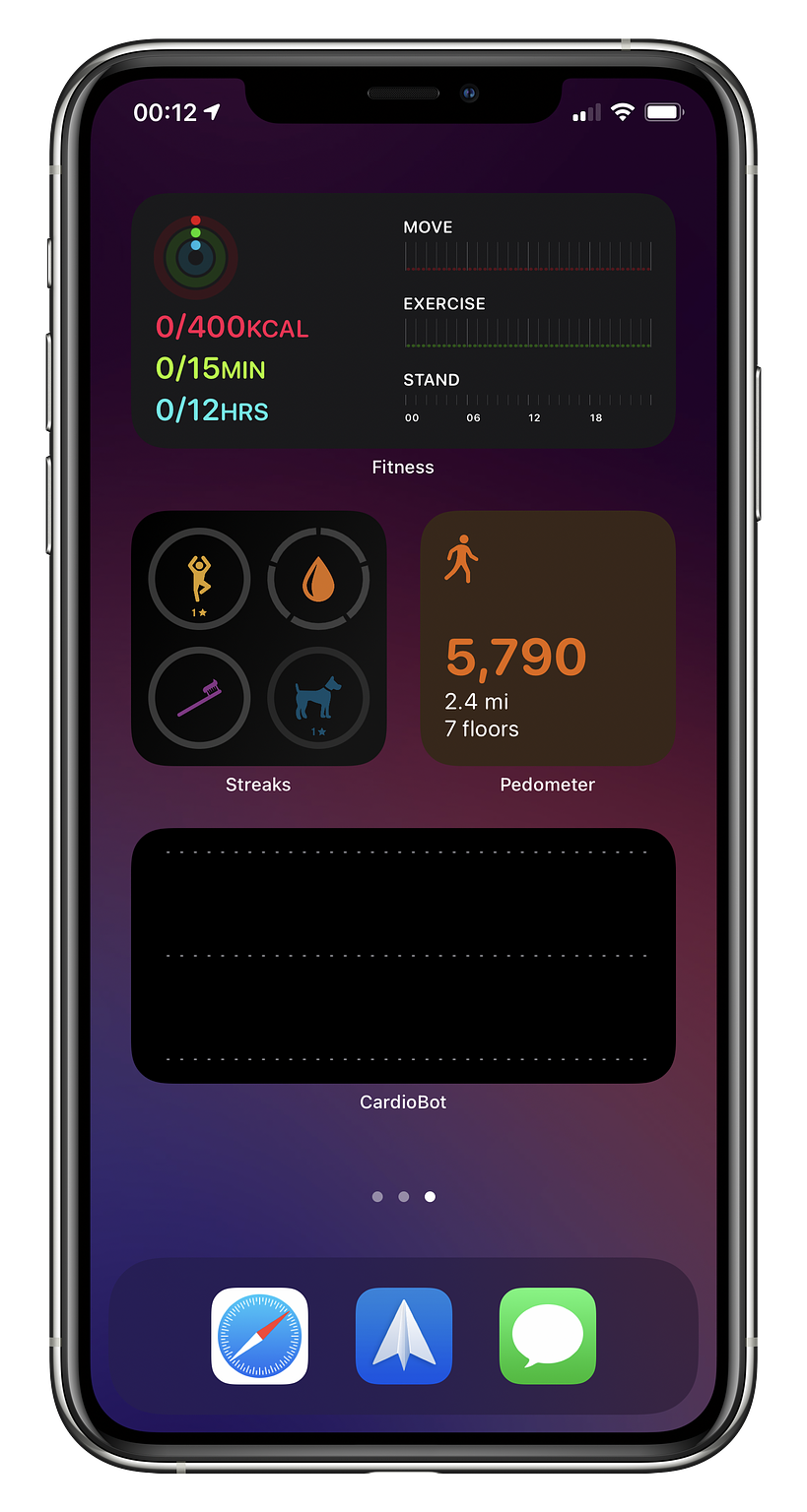
This view pulls in some key metrics to help me keep on top of healthy living whilst working. The top section utilises Apple’s own Fitness app widget, followed by some ‘smart stack’ small widgets. This consists of the Streaks app, which I’m using to track a few basic health actions for now. It also includes a nice little Sleep++ widget so I can see how well (or badly as the case usually is) I slept last night.
This page is usually in use alongside the Work one, to encourage me to try and stay active as much as possible during working hours. Now I, and many other people, are working from home it’s very easy to slip into a habit of just not moving from your desk unless it’s to go and get your 5th packet of Monster Munch. Having this information displayed and in your face is extremely helpful.
The ‘Me Time’ phone
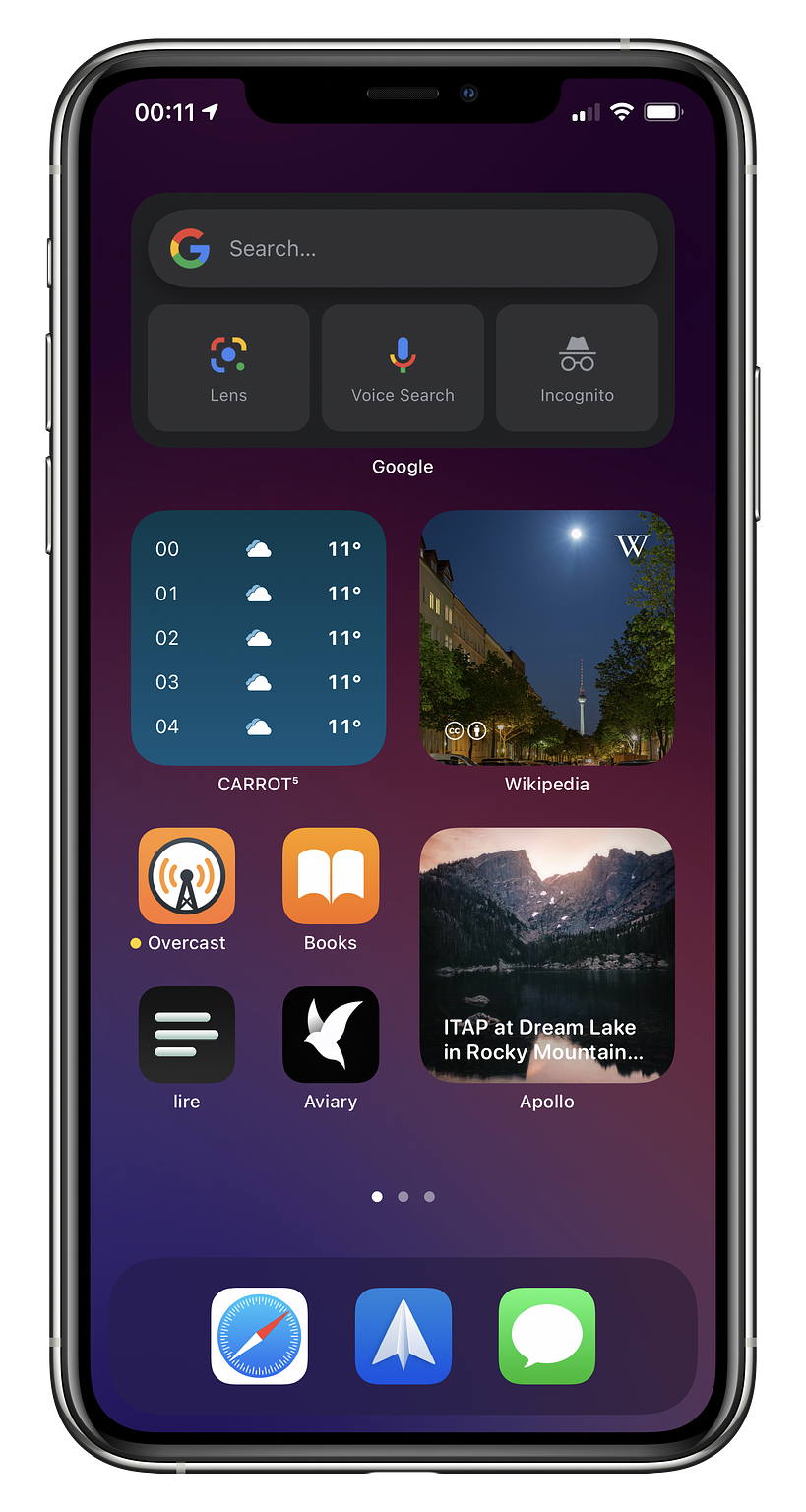
Last, but by no means least, comes the screen I use the most over the evening and weekend. At the top I use a another Smart Stack, predominantly set to the Google Search app. Much like Fantastical, I don’t really use the base app, but the Search bar it adds to your homescreen is very handy, offering up a quick link to text search, voice search, private search and even the Google Lens function. This is one of the more functional widgets I’ve seen and, despite the fact all the buttons do is launch into the app, it does so very quickly, so it doesn’t really feel like an extra step.
Included in this stack is also the excellent Carrot Weather widget. This is yet another example of a widget being more appealing that the app itself. Whilst Carrot is of course a very well made app, I’m not a huge fan of it personally, but the widget is well designed, seems to refresh well and fits the homescreen design well. Finally I’ve included the Day One widget in there, mainly to encourage me to use the app to be honest. I love Day One, it’s an incredibly well designed app / service, but I am truly terrible at updating it. I’m hoping this will get me using it more.
I then have a few small widgets rounding out the homescreen. Most of the apps included in these stacks are fairly uninteresting, such as the stock Reminders one and another Carrot one. A couple that I want to call out, however, are the Wikipedia one and Apollo. The Wikipedia one in particular is a real highlight for me. The team added a couple of examples of really ideal widgets. My favourites are the ‘Picture of the day’ one and ‘On this day’. Widgets on iOS can’t refresh constantly, which works perfectly for the type of widgets Wikipedia are using. You get a nice, interesting piece of information presented to you to take a look at at some point in the day. Not only are these often very interesting, but in the case of the picture one, you get an ever changing, often beautiful view of the world.
The Apollo widget is very similar to the Wikipedia one, in my setup at least. You get an option to add a photo widget which pulls in images from some set subreddits such as /r/wallpapers, which is what I have it set to, or you can add your own favourites. It’s very well done, refreshes regularly throughout the day and pretties up my homescreen no end.
I’ve tried to call out some of my favourite third party widgets in this post, but I also want to call out my favourite stock one, namely the Apple Photos widget. We all take hundreds and thousands of photos every year, and most end up hidden away in the Photos app, never to be seen again. The Photos app already did a good job of trying to surface these, in the ‘For You’ section, which I did browse occasionally, when I remembered, but the widget is really great at both surfacing and presenting you with a little snapshot into your life throughout the day. This one certainly speak joy for me.
While Widgets could definitely be more flexible and interactive, in their current form they present far more utility and interest for me than I’d have imagined. I can only assume they’ll get more functional and powerful in iOS 15 and beyond and I’m already looking forward to what comes next.
