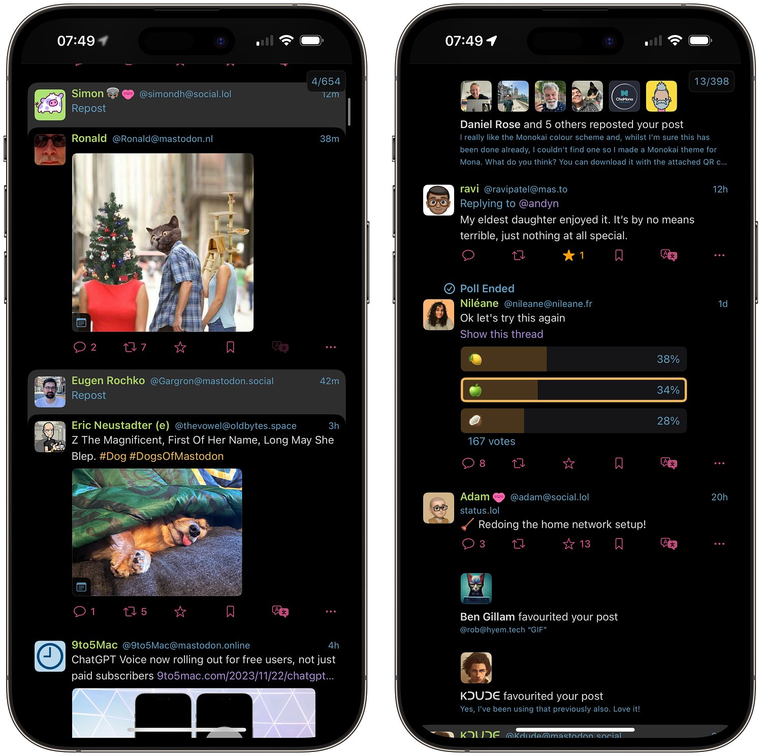
Monokai inspired Mona theme
I've enjoyed the Monokai colour scheme for a while and it was the inspiration for the colours used on this blog. Well, the dark mode at least, though I use slightly bolder versions. I think it's safe to say it’s an acquired taste, and I have a feeling it might be a bit of a 'love it or hate it' kind of situation.
Whilst Ivory has been my Mastodon app of choice since it's release, Matt's post about cutting back on subscriptions got me thinking of what I might be able to drop myself. To this end, I started using the Monaapp again. Whilst the UI is, in my opinion, a lot more utilitarion than Ivory, it's a very competent app and offers a lot of customisation options. One such option allows you to customise the colour of the majority of UI elements. Logically, given my affinity to the slightly off the wall Monokai scheme, I had a stab at implementing something similar in Mona.

I've already shared this on Mastodon earlier today, but thought it would be worth sharing here also.
The theme is avaialble as dark mode theme only, for now, but should you want to use it yourself, open THIS which should open Mona on your device and apply the theme. A QR code is avaialble via on my Mastodon post also, though I heard this morning that wasn't actually working, so I wont replicate that here. I’ve also added one with a true blackbackground if you find this one too ligh, which you can grab HERE. I think this one looks the best, to be honest.
This is obviously a pretty basic theming effort, utilising a handful of colours, but if you use it, and like it, feel free to let me know. I’m no designer, so if you find a combination of these colours that works better, again please feel free to share
