Arc Mobile 2.0 - Arc Search
Technology
A few days after The Browser Company quietly pulled their Arc browser companion app from the App Store, it appears they are back with the teased 2.0 release, now called Arc Search.
The app only, seemingly, launched an hour or so ago, so I’ve not put it through its paces fully, so consider this a brief overview rather than any kind of review, but I wanted to share a few early impressions.
The original Arc Mobile was marketed as a ‘companion’ to the main desktop client. Whilst it had a lot less features than its cousin, it did allow a limited level of sync between the desktop and mobile client. With this ground up redesign, however, The Browser Company appear to have gone in a completely different direction. Whereas the original companion app had a limited level of sync and feature parity with the desktop version, Arc Search seems to forgo any connection to the main client entirely.*
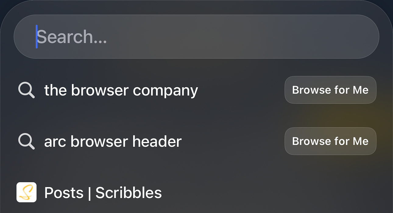
Upon launching the app, after being asked to set the app as your default
multiple times(!) you are presented with a simple search box and, if
you’ve browsed before, a short history.

If you search for anything and just hit enter you receive some standard search results, via Google. It's not clear at first, like at all, but if you write in a full domain or URL in the search button and 'search' for that, you will land directly on this URL. There, strangely, doesn’t appear to be any way to choose your own default search engine, which doesn’t feel ideal to me. Given Arc like to block ads, and doesn’t have tracking etc. this seems like a strange choice of default browser, unless some money has exchanged hands here. Not being able to choose your default search engine is a little bit of a deal breaker for me, I genuinely prefer Bing in many ways now that I’ve been using it for a few years.
Search engine aside, there isn’t too much more to write home about when
it comes to the standard experience. It’s only when you press the
‘browse for me’ button, that you may have noticed in the
screenshot above, that things start to get a bit more interesting. This
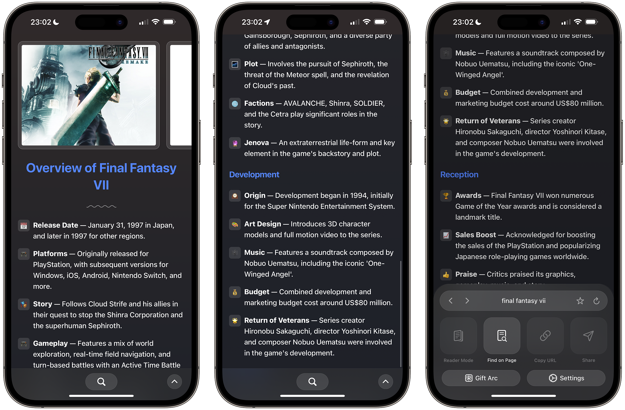
option scrapes 6 sites for a response to your enquiry, which it then
summarises for you in a quite attractive summary page, as seen below:

Depending on what you search for, it compiles the results into a nice overview page, with different subsections. When I tested this some of the results were a bit hit and miss, showing results for Ark the mobile game, instead of Arc, but when it did get the right information it was really quite impressive and looks like it could be very helpful. In a test search for ‘1066’ (the year of the Battle of Hastings for anyone that was not aware) it included a ‘dig deeper’ section, in which a load of source websites and information was provided if you wanted to get more information, or see the sources for the information it had already pulled.
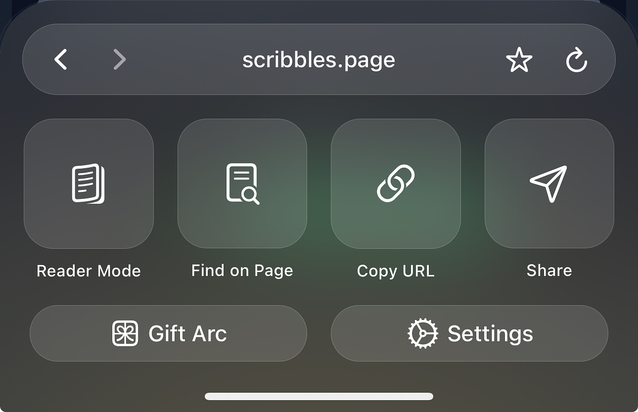
Beyond this fairly unique, AI based search paradigm, there isn’t actually all that much more to say. It’s incredibly basic, more so than I was expecting after the various teases over the last few weeks. You can do the basics you’d expect from a browser, such as copy links, or share them to other apps. You can also search on the page, mark a page as a favourite, or enter Reader Mode. You can also navigate directly to any page by typing the full address as you’d expect, though it’s not immediately obvious where to find this I thought.

The app also supports iCloud Keychain passwords which will help with the transition over.
I’ve set the browser as my default for a bit to give this a test run,
and to see how it goes. I’ve been using Arc as my default macOS browser,
and as of a couple of days ago, have done the same with their early
Windows version as well. So, I’m clearly all in with the
company and service for the time being, so it’s a bit of a shame there
isn’t that much in the app, and in the experience of using it, that
feels particularly Arc-like. I didn’t actually expect it to
interact less with the desktop client than the old version, but
it still feels like a fun new experience regardless. Hopefully it’ll be
iterated on over time and it’ll start feeling more Arc-y, but for now
I’m going to embrace the AI solution proposed here and see if I can get
better than a 50% match rate of actual intended results. At the end of
the day, the browser can be as beautiful or ugly as it can be, but its
success as a tool will come down to the responses you receive. So far,
as I say,
It’s hit and miss. This summarises my experience with all
AI products to date, so it’s to be expected.
I was excited for this release, and despite the fact it’s a little underwhelming compared to my own expectations, it’s fast, lightweight, and fun so I’m definitely going to give it a shot and I look forward to seeing how it (hopefully) receives some meaningful updates and improvement over time.
——
*Edit:
Vincent has kindly pointed out that Josh Miller, CEO of The Browser Company, has shared a post on X, which Vincent has kindly reshared on Mastodon (sorry!) with some more details about where desktop sync is. Essentially this current version will be updated to just be ‘Arc’ once their new syncing service, ‘Arc Anywhere’ is available in the coming months. This will then enable the syncing of your tabs between Windows, macOS and iOS. The entire write up is pretty interesting and explains a few of the reasons behind some of the seemingly odd decisions.
